Basketball Jersey World: UX Redesign Case Study - Phase 1
-
ClientBasketball Jersey World
-
PlatformsShopify
-
SolutionsUX Design
Discover how OSE's user experience design team is working with Shopify retailer Basketball Jersey World to deliver a fast-loading, more streamlined customer experience.
OSE began working with the team at Basketball Jersey World to deliver an enhanced user experience across their Shopify eCommerce store. The goal was to not only make it easier to locate niche products, but improve the visual design elements across mobile and desktop devices from their current offering.
When it comes to Shopify, just like any other eCommerce platform, UX design plays a major role in the level of conversions you’re able to achieve, how fast your pages load, and the time you can keep your customers engaged on your platform, especially on mobile devices.
With most eCommerce sites seeing upwards of 70% total visitation coming from mobile devices these days, Basketball Jersey World was no exception. Primarily retailing fashion and accessories across their physical stores and online retail channel, figures such as this are incredibly common in these industries. So, the first thing we needed to do was diagnose which areas of the site needed work from a UX perspective, and begin designing a mobile-first experience that would increase purchase rates.
Fundamentals of a Mobile-First UX Design
Mobile-first design is not a new concept, but is surprisingly rare in creative agencies.
Essentially this concept requires a design team to deliver key mobile screens and feature sets prior to their desktop counterparts. This involves taking apart key sites areas such as header and navigation blocks, predictive search results, category tiles, and product pages to ensure users can achieve the following with the least amount of resistance:
• Find niche products in no more than two clicks
• Ensure search results are as rich on mobile devices and they are on desktop
• Evaluate similar products whilst searching for specific products (i.e. the full range of Michael Jordan jerseys)
• Browse site areas comfortably with their thumbs and/or index fingers (i.e. designing for the thumb zone)
• Browse site pages with the highest speed possible for mobile devices
• Achieve critical tasks such as adding to cart and completing purchases via an experience that instils trust and confidence in the site delivering the environment
Funnily enough, the above seem pretty obvious right? But take a look around a series of your favourite sites, and you’ll likely find the above items lack at times.
Improving Shopify User Experience Design
Our initial analysis of the Basketball Jersey World (BBLJW) site found that the following key areas needed attention, and would form part of Phase 1 of these Shopify UX enhancements.
Before
As shown in the screenshots to your right, the site header on mobile and desktop devices took up nearly 40% of the vertical screen space on the BBLJW site. This fundamental issue was the first item we needed to amend when it came to the header redesign.
With so many menu and submenu items part of the information architecture, none with any visual hierarchy over any others, this was another area which needed addressing.
Combine this with a greater focus on search and predictive search results (including popular terms), and it was clear to our team, that Basketball Jersey World was going to see some really solid improvements to their UX.
After
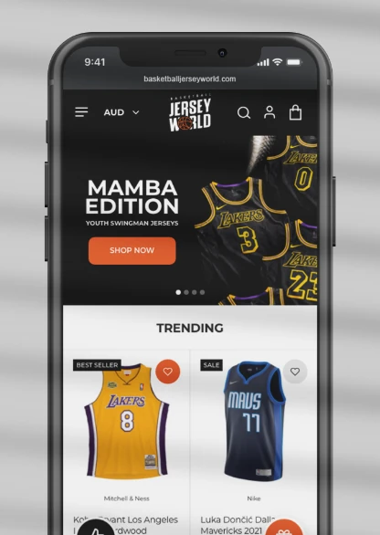
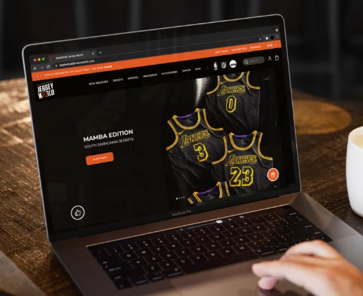
By reducing header height, and using colour separation to add a key area for messaging (i.e. Sales and New Releases), our team was able to begin to deliver more value using less screens space on mobile and desktop devices.
When it came to mobile menus, research showed us that users enjoyed searching as much as they enjoyed browsing key categories. To balance this, our goal was to ensure both items worked in harmony.
By structuring the mobile menu with search at the top, level 1 categories beneath, followed by key call-outs (i.e. New Releases & Gift Cards), we delivered a top-level mobile menu experience that was a breeze to navigate.
When it came to the submenu of the BBLJW site, on desktop we implemented a simple visual approach for menu groupings such as T-Shirts, Hoodies and Jerseys, which matched call-outs for focus sports such as the NBA, NFL and NCAA.
Where sub menus were concerned, we found simple links enough for this product piece on mobile. This differed from the current design, and adhered to simple thumb design techniques.
Homepage UX Redesign
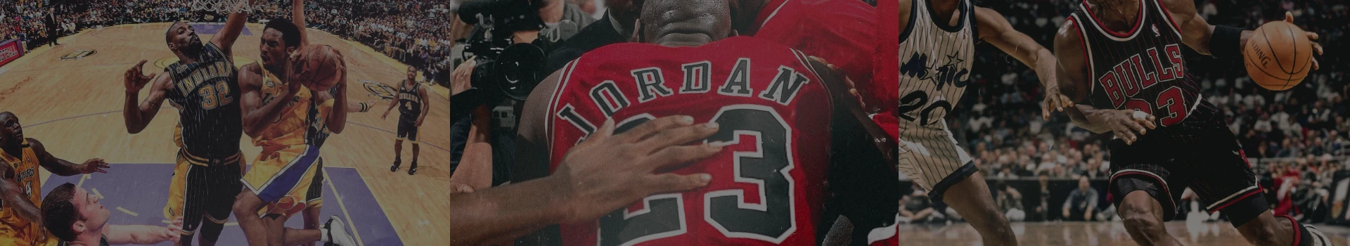
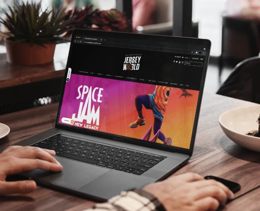
When you’ve got a site with great product to work with such as current NBA jerseys, vintage wares from Mitchell & Ness, and limited-edition apparel from the new Space Jam movie, it makes putting together screen layouts a lot easier.
With this in mind, we began at the top of the BBLJW home page focussing on how we could deliver an improved hero banner experience on mobile and desktop devices. Because the amount of screen space being used and scalability on mobile devices were clear issues, we could see we were going to get some quick wins by re-working these areas.
Next, we looked at the Trending Items section. The major issue here was was that the tiles were missing ‘Add to Cart’ buttons. This feature is something we’ve found really helps merchants deliver increased conversions, and when combined with improved UX layout, generally goes a long way to adding more dollars in your pocket.
When we asked the team at BBLJW what their best-selling items were, there was no surprise that Michael Jordan and Kobe Bryant were involved. So why not deliver a block focussing on the greatest jerseys of all time? This was something we called out individually on our mobile and desktop layouts, positing this block above numerous existing items. As you can probably tell, we’re structuring the BBLJW home page in order of priority items, just the way a newspaper article does.
This technique is something we continued with, moving the existing CTA’s block under Best Sellers and a newly created interactive section where you can choose to navigate by team, even at the NBA, NFL and NCAA level.
When it comes to UX design, especially on pages such as home pages, quality of implementation is a major factor which influences conversions and builds trust in a brand. In the case of BBLJW, the existing content on the home page was not terrible, it just needed modernisation and prioritisation, and you can see from the new designs, the OSE team really hit the target for this fantastic merchant, with a home page design that not only had purpose, but looked great too.
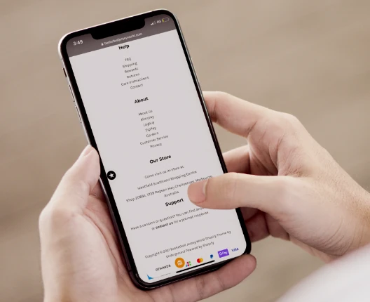
Before
In eCommerce, footer design is often overlooked as an opportunity to build subscribers and deliver key links.
In the case of BBLJW, although all of the common ingredients were present, they were cluttered and not structured in a way that would prioritise undertaking these actions.
For example, although social and newsletter subscription services were available, they were equally weighted with other less important features. This was about to change.
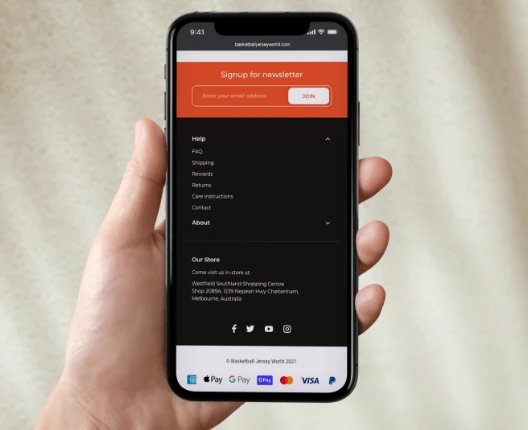
After
As shown in the screenshots to your right, the site header on mobile and desktop devices took up nearly 40% of the vertical screen space on the BBLJW site. This fundamental issue was the first item we needed to amend when it came to the header redesign.
With so many menu and submenu items part of the information architecture, none with any visual hierarchy over any others, this was another area which needed addressing.
Combine this with a greater focus on search and predictive search results (including popular terms), and it was clear to our team, that Basketball Jersey World was going to see some really solid improvements to their UX.
We Should Talk.
 1300 810 920
 4/110 Eagle Street
Brisbane QLD 4000
4/110 Eagle Street
Brisbane QLD 4000
Technology Partners